Motivation
In general, we have Several commercial software packages in market to draw data and their summaries. However,ideally, such tools should be open source, freely available and allow contributions or modifications by users. Inspired by Prof Kam, with the acquired coding skills and understanding of data ,this group project aims to create such flexible website by making use of interactive visualizations to answer questions from VAST Challenge 2022 Challenge 3 to find out the Economic status of the City of Engagement, Ohio USA.
Problem Statements
Following are the questions we aim to answer, referencing from VAST Challenge 2022 Challenge 3 questions:
Challenge 3: Economic considers the financial health of the city. Over time, are businesses growing or shrinking? How are people changing jobs? Are standards of living improving or declining over time?
Consider the financial status of Engagement’s businesses and residents, and use visual analytic techniques to address these questions.
- Over the period covered by the dataset, which businesses appear to be more prosperous? Which appear to be struggling? Describe your rationale for your answers. Limit your response to 10 images and 500 words.
- How does the financial health of the residents change over the period covered by the dataset? How do wages compare to the overall cost of living in Engagement? Are there groups that appear to exhibit similar patterns? Describe your rationale for your answers. Limit your response to 10 images and 500 words.
- Describe the health of the various employers within the city limits. What employment patterns do you observe? Do you notice any areas of particularly high or low turnover? Limit your response to 10 images and 500 words.
Approach
Question 1
It is observed from the datasets provided by VAST Challenge 2022 that there are two types of businesses present in Engagement, Ohio USA, namely:
- Restaurants;
- Pubs
They will be evaluated based on:
- Frequency and number of participants’ visits;
- Revenue (participants’ spending)
According to the dataset descriptions provided by VAST Challenge, all restaurants have a Prix Fixe food cost for participants to dine in and all pubs have a hourly cost to visit the pub. Therefore, assuming all visits to restaurants are for dinning, restaurants’ revenue will be calculated by number of visits times Prix Fixe food cost. Similarly, pubs’ revenue will be calculated by duration of visits times hourly cost of visits.
Alternative approach of deriving balance difference before and after restaurants and pubs visits as spending is considered but not preferred as balance differences are inconsistent and could be due to unknown reasons.
Question 2
One question which rides in the minds of every reader who resides or does not reside in a city is - How expensive or affordable is the cost of living here? Can a resident residing here build up a good bank balance over the years?
Keeping the sample of 1000 participants in mind, this segment will help study the financial health of each of the participants.
The FinancialJournal.csv helps understand the expense in categories such as Food, Recreation, Shelter and Earnings such as Wage. (Assumption : All positive values corresponds to credit and negative ones are debited)
Trellis Display can be used to understand the cost of living of each of the participants. This will also give us an idea on the living index of the city over the months to see if the living standard increased over the months which may have motivated participants to leave the city.
The sample collected consists of diverse participants. Participants can be partitioned based on the educational qualifications, Number of Household members, Interest groups (A-H), Age groups, etc. We can use such partitions to our favour to understand the similarity between groups.
Since we are dealing with our data in monthly format, Column Graph can help us understand the expenses incurred by these groups.
Ridge plot can help us understand the distribution in the expenses over months during peak and off peak seasons
To understand the earning pattern of the participants, a Lorenz curve can help us understand if the rich gets richer.
With the help of Interactive/Coordinated plots (Example: Scattered plot), we can also understand if people who earn more, spend more and if we see any relation with joviality.
Question 3
Financial health of the employers
By merging jobs.csv and employers.csv by employerId, we can find out which employer pays more and thereby we can arrive to the conclusion of financial status of employers.
Also by deriving Which employers have the record of most numbers of employees switching jobs, we’ll understand their workspace culture and how likely the employer(company) may be referred to ?
Employment patterns
We can also find out how many jobs does each Workplace provding with the help of jobs.csv and employers.csv
Also, with the help of jobs.csv file, let’s try to find if there is any correlation between employees’ pay and their educational qualification.
Turnover Analysis
To analyse the turnover, let us have a close look on TravelJournal.csv. Once the data wrangling (filtering out the purpose of Work/Home commute and grouping by participantId, travelEndLocation) is performed, we are not just finding out the overall turnover percentage rate but also with the help of apprpriate visualisation we are able to find out the exact participants who have disappeared from local job market, and who have partially employed by examining the no. of rows (n).
Early Prototypes
Reveal the prosperity of the restaurants and pubs
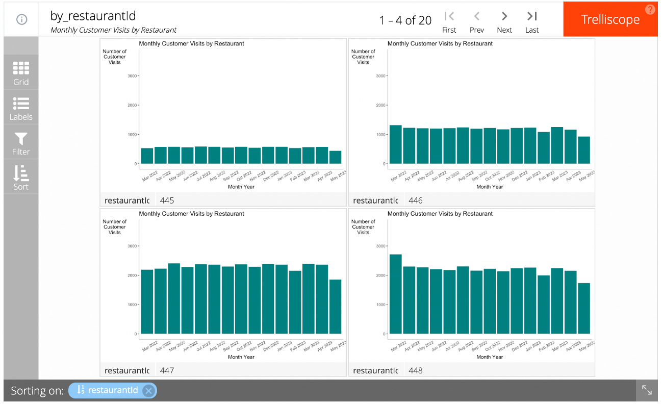
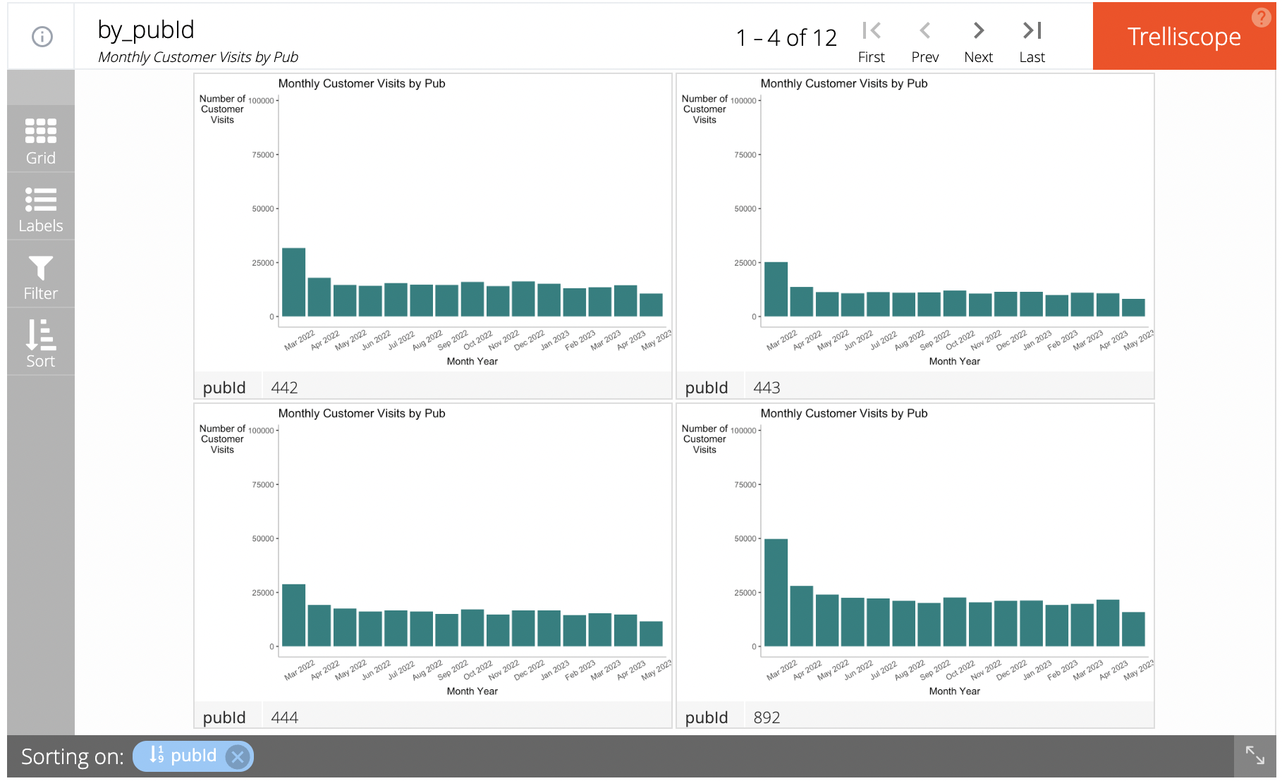
We propose to use two trellis plots on restaurants and pubs’ number of customer visits to illustrate the prosperity of the restaurants and pubs’ business. The nature of the trellis plot also allows users to sort and filter the visualization based on different conditions.
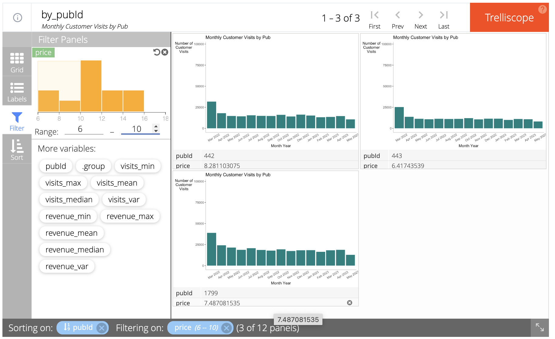
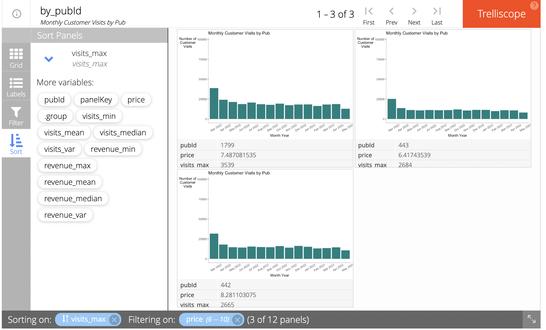
For example, users can filter by price of the pubs’ hourly cost and sort the trellis plot by descending order of the largest number of visits, to find out the most popular pubs in the given price range.
Understanding the cost of living of Participants
Graph: Line chart in Trellis Display 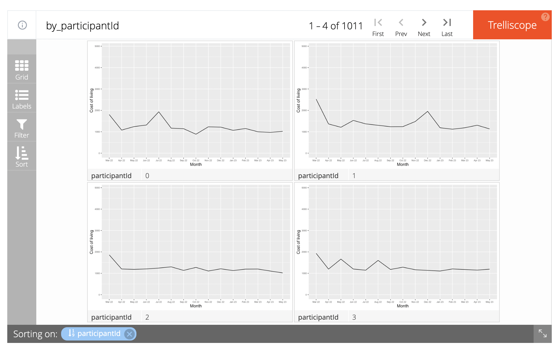
Rationale: It will help us to understand the cost of living of each and every participant and given the functionality of the Trelliscope, we can add additional filters such as educational background and age group to understand the trends amongst such groups
Comparing and relating the earning and expenditure trends
Graph: Scatter plot for each of the components, designed in a coordinated way
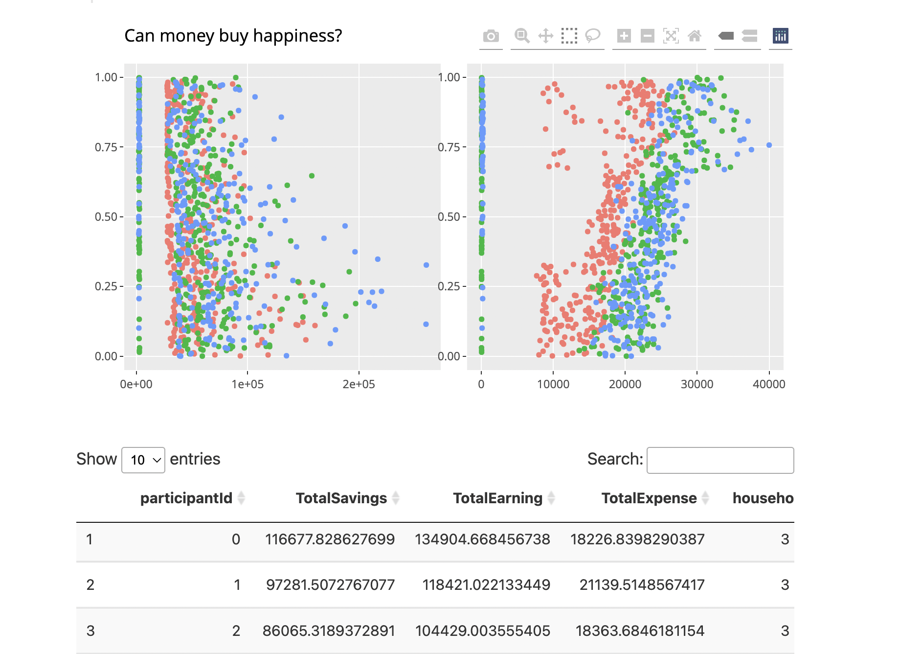
Rationale: We would be able to highlight and deep dive on unusual trends and the table will help us understand the attributes.
Finding out the similarity between groups
Graph: Column graph depicting the expenditure patterns.
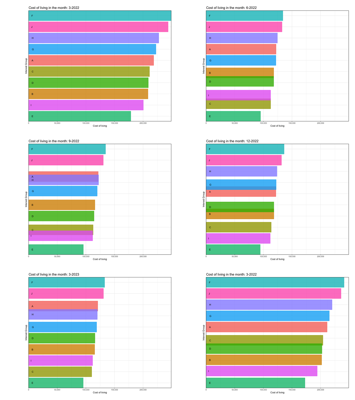
Rationale: By creating an animated graph seperated between months, we can observe the rise/fall in the expenditure pattern between groups
Inequality amongst participants
Graph: Lorenz curve
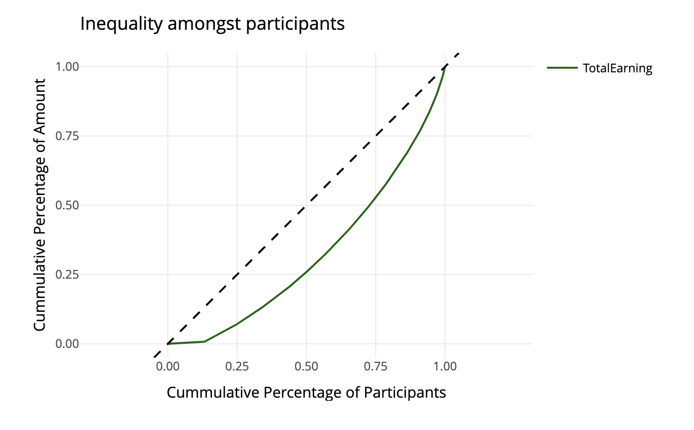
Rationale: A Lorenz curve is a graphical representation of the distribution of income or wealth within a population.
The rise/fall of available balance
Graph: Slope Graph
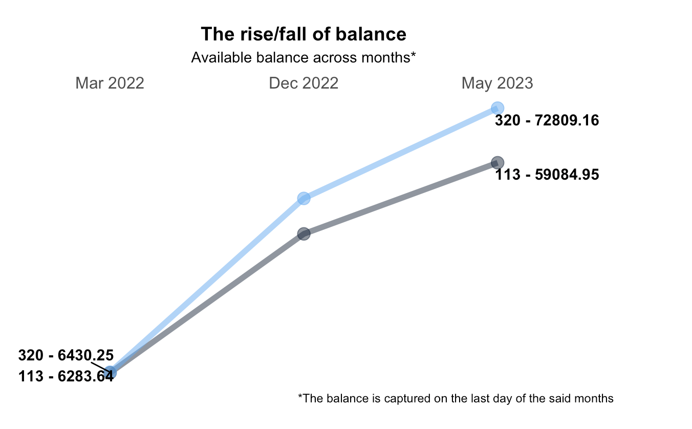
Rationale: This will help us compare between participants and depict a graphical representation of the financial health over the months
Understanding the opening and closing monthly expense
Graph: Candle Stick
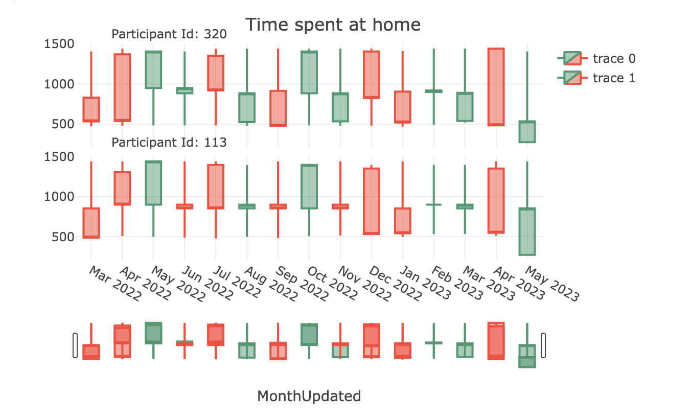
Rationale: Like the opening and closing figures of stock market, we can notice the same here with the available balance and understand the peak months when the expense has been ceiling high.
Graph : Boxplot
image: 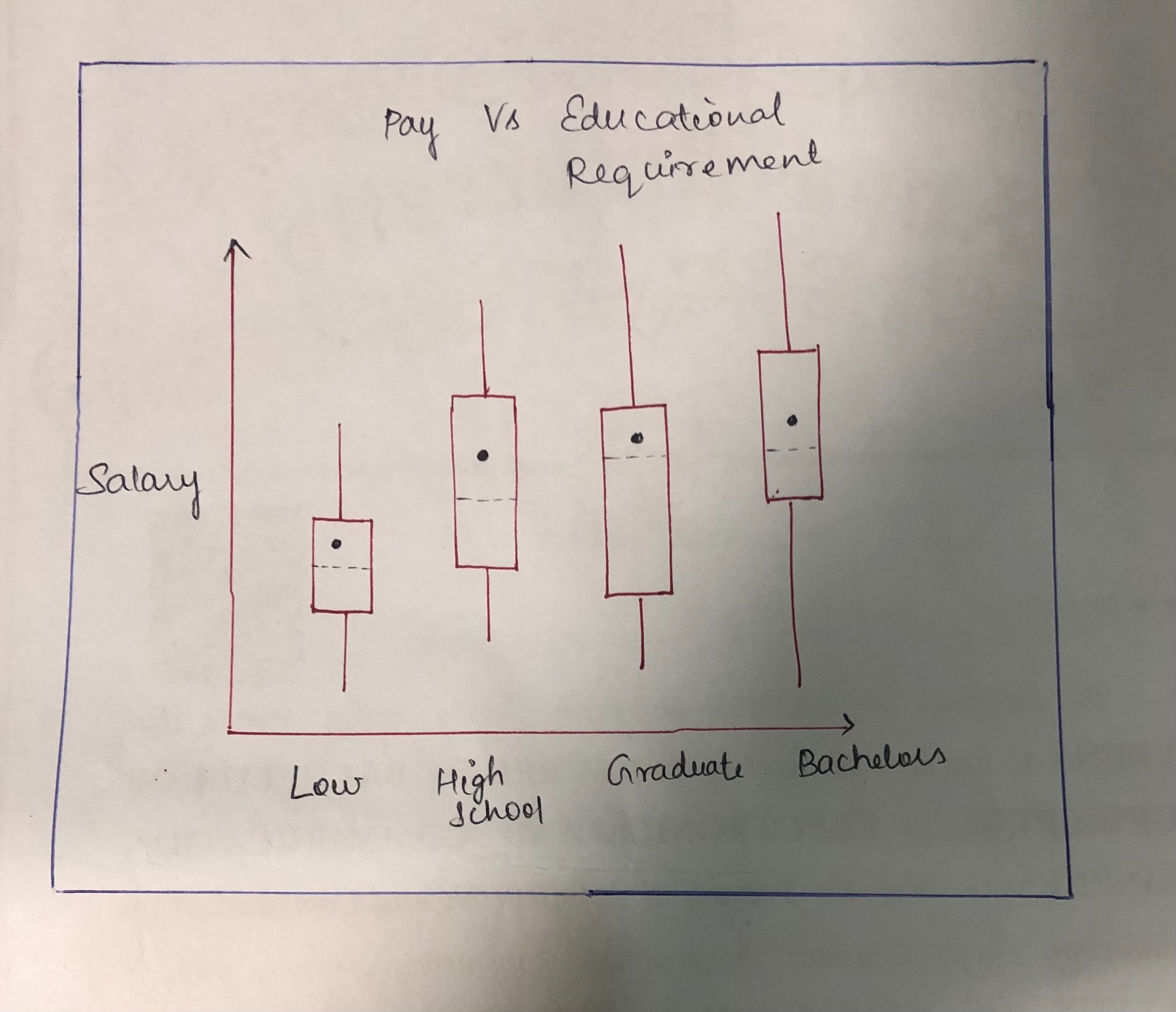
This boxplot helps us to understand pay of participants with different educational qualification. The minimum, maximum, median and also mean pay of the participants for each educational background can be examined.
Graph : Line chart
image: 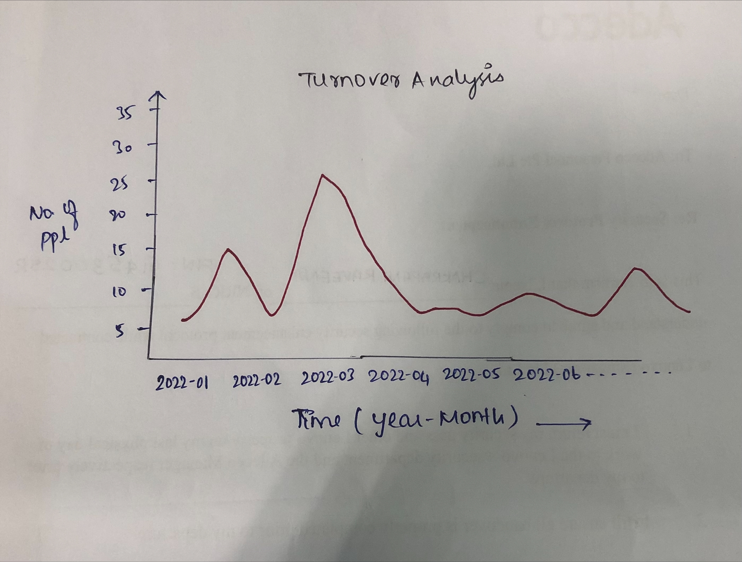
This graph helps us to understand the no. of participants who left a workplace over a period of time.
Graph : Treemap
image: 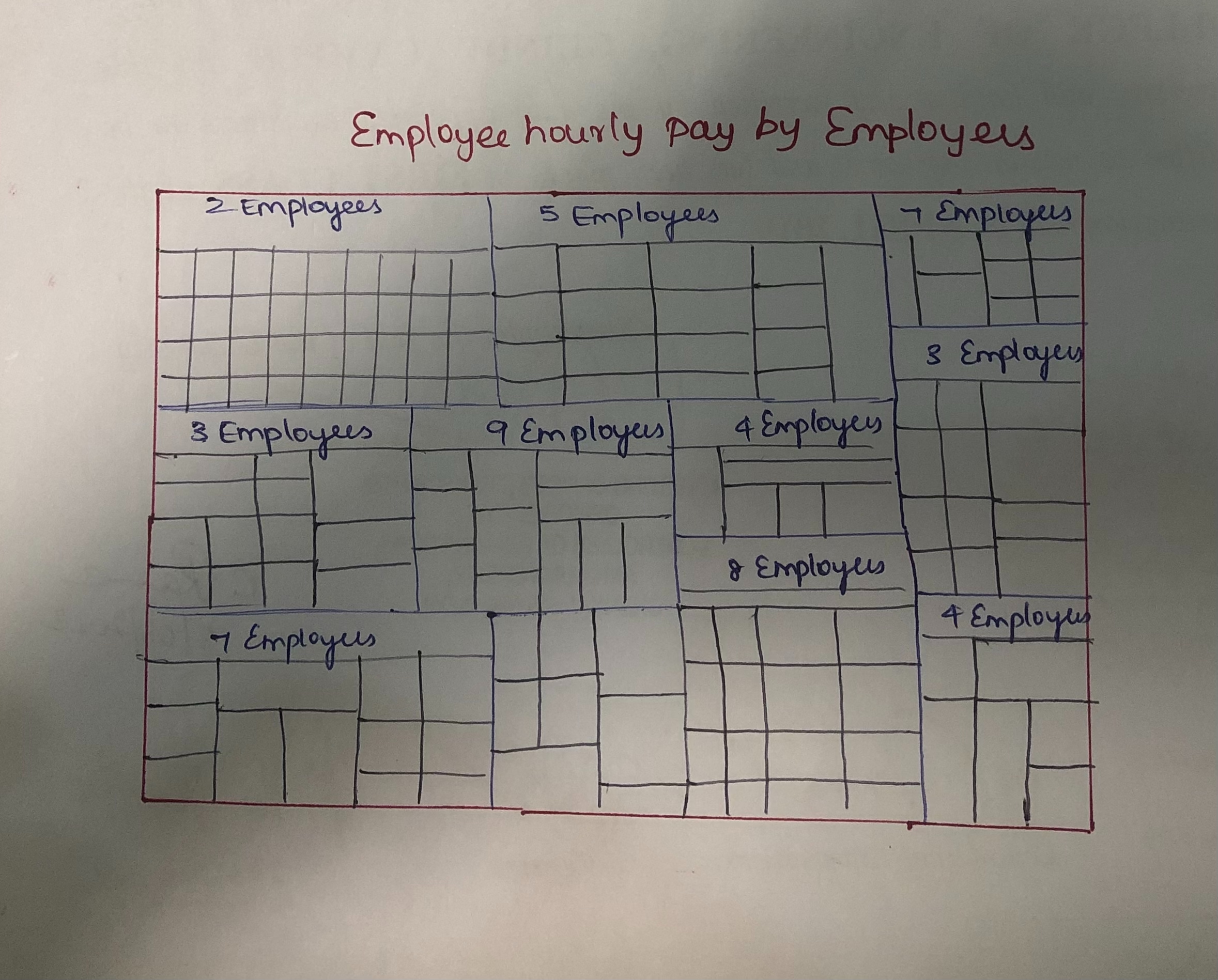
The tree map allows us to look at both the overall prosperous and struggling businesses for each size of the workplace, as well as the overall proportion of the business that is contributing to job provision based on the relative size and shade of the shape.